Updated 26 October 2026
A paint shade can look different once it is on a full wall and lit by your bedside lamp. These 12 bedroom colour combinations offer starting points for Indian homes. Choose around the light, furniture and size of your own room, then test the actual paint before committing.
How to Choose Bedroom Colours
Start with the surfaces that will stay: flooring, wardrobe shutters, the bed and curtains. Shortlist two main colours that work with these finishes. Test larger swatches in morning, afternoon and evening light. A phone image or small printed sample cannot show exactly how a shade will behave in your room.
The 60–30–10 rule can help balance a dominant base, a secondary colour and a small accent, but it is a guide rather than a fixed formula. For a low-light bedroom, keep the main surfaces lighter and introduce contrast through a smaller feature. Compare matt and washable finishes according to cleaning needs.
12 Bedroom Colour Combinations
Sage Green and Warm Beige
Sage green works as a muted feature wall while beige keeps the remaining surfaces warm. Repeat one shade in curtains or cushions rather than adding several competing accents. Check the green beside your wardrobe finish: the same swatch can look greyer in a shaded room and brighter beside a sunny window.
Dusty Blue and White
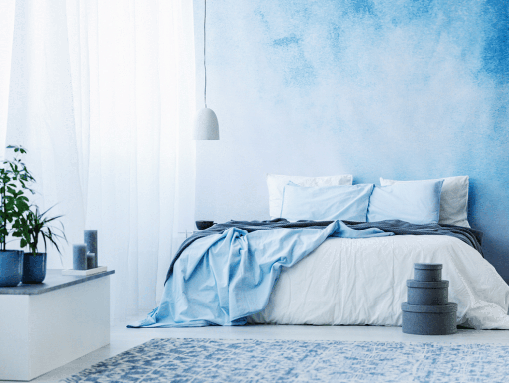
Dusty blue with a warm white base creates a restrained bedroom palette. Use blue behind the bed or through bedding if you rent and cannot repaint. Compare the white against your ceiling and existing furniture before choosing it, because a cool white can make warm wood appear more orange.
Charcoal and Dusty Pink
Charcoal adds contrast, while dusty pink softens the effect without requiring bright colour across every wall. Reserve charcoal for a limited area if daylight is weak. Keep large wardrobes and bedding lighter so the feature wall remains the focal point rather than making the whole room feel enclosed.
Navy and Muted Gold
Navy pairs well with small brass or gold-toned details such as a lamp, handle or picture frame. Use a light ceiling and a pale adjoining wall to balance the darker surface. Metallic paint is optional; ordinary fittings can introduce the accent without committing to a highly reflective wall finish.
Terracotta and Cream
Cream balances terracotta and works with timber, woven textures and neutral bedding. In a compact room, keep terracotta to the headboard wall or soft furnishings. Test it under your bedside lamps, as warm lighting can make an already warm colour appear stronger than it did in the paint shop.
Warm White and Natural Wood
Warm white is useful when the wardrobe, bed or flooring already provides visual detail. Let the wood finish act as the second colour and introduce texture through curtains or a rug. Compare paint samples with the largest timber surface first; matching every small accessory is less important than getting that relationship right.
Lavender and Soft Grey
A muted lavender and a light grey can suit a bedroom shared by children or teenagers without using a bright theme. Choose one dominant base and use the other selectively. Ask the occupants to compare larger samples under the actual lights, rather than selecting a shade from a phone screen alone.
Peach and Ivory
Soft peach adds warmth to an ivory base and can be introduced through paint, bedding or curtains. Keep the peach subdued if there is strong afternoon sun. This pairing also gives a simple route to a future refresh: accessories can change while the main ivory surfaces stay the same.
Mint and White
Mint can work as a light accent against white when a small bedroom needs a limited palette. Avoid covering every item in a matching shade. Use the wall colour as a reference, then keep storage, curtains and bedding quiet so the room has visual continuity and does not feel busy.
Olive and Off-White
Olive gives a room a more earthy character, while off-white provides a lighter background. Use a small sample beside dark wood before committing to a full wall. If the combination feels too heavy, move olive to cushions or the headboard and retain the off-white on the larger painted areas.
Greige and Teal
Greige provides a neutral base between grey and beige, with teal adding a controlled contrast. One teal surface or a few accessories are usually easier to coordinate than several bold walls. Look at the pairing beside both your daytime light and evening lamps before deciding how much accent colour the room needs.
Sky Blue and Sand
Sky blue and sand create a light pairing that can be adapted to a master bedroom or a guest room. Use a sand-toned wall or textile to avoid an entirely cool scheme. Keep the ceiling simple and repeat one of the two colours in the bedding to connect the main surfaces.
Small Bedrooms and Kids’ Rooms
For a small bedroom, use a light base with one accent and limit abrupt changes between walls, storage and curtains. Strong red, orange or brown can be used in accessories rather than across every wall. Read our guide to colours for small bedrooms for more planning ideas.
For kids’ and teens’ rooms, choose a flexible base that can work as their preferences change. Lavender and grey, mint and white, or peach and ivory can be adapted through bedding and accessories. Let the child help choose between a few tested samples, and plan a clear, well-lit study area.
Coordinate Paint, Wardrobes and Lighting
Place the paint sample beside a wardrobe laminate sample before ordering either finish. Under warm bulbs, beige and terracotta may appear stronger; cooler bulbs can alter the appearance of grey and blue. Check reading lights separately from general ceiling lighting. A designer can help compare the whole palette in a room layout.
Explore bedroom interior design, bedroom design ideas and our design ideas collection. For a wider project, review our turnkey interiors service.
Visualise Your Bedroom Before Painting
Bring room measurements, photographs and finish samples to your design discussion. A coordinated plan can show how the wall palette works with storage, lighting and furniture. Talk to a designer or try the cost estimator to start planning.


Blue is a classic, calming colour for bedrooms. Light blue walls evoke feelings of tranquility and work well with natural wood tones. Navy blue walls create a dramatic look and pair nicely with metallics like gold or silver. For a beachy vibe, choose a sea green-blue and add natural fiber rugs, rattan furniture and driftwood accents.
Frequently Asked Questions
Which colour combination is best for a bedroom?
The best combination depends on daylight, room size, furniture and personal preference. Warm white with beige, sage green with natural wood, or dusty blue with white offer useful starting points. Compare large samples in your room before choosing a final shade.
What colours make a bedroom feel calm and relaxing?
Soft, muted colours such as warm white, beige, sage green, dusty blue and light grey can support a calm setting. A limited palette, comfortable lighting and fewer strong contrasts matter as much as the paint colour itself.
What are the trending bedroom colours for modern interiors?
Warm neutrals, muted greens, dusty blues and earthy accents are options to explore. Treat trend lists as inspiration rather than a requirement: choose a combination that works with your furniture and is comfortable under the lights you use every evening.
How do I choose a colour combination for a small bedroom?
Start with a light or warm neutral base and add one accent. Repeat the base across large surfaces to keep the scheme continuous. Check the wardrobe and curtains alongside the wall paint, and avoid introducing several strong colours in a room with limited daylight.
Can I use dark colours in a bedroom?
Yes. Navy, charcoal or deep green can add contrast, particularly on the wall behind the bed. Balance a dark feature with lighter adjoining walls, bedding and ceiling. Test a larger sample first, especially if the room has a small window or low natural light.
Which colour is best for a bedroom as per vastu?
Vastu preferences are traditional guidance and vary between practitioners. If you follow them, discuss the preferred palette with your family and designer while still checking daylight, comfort and existing finishes. There is no need to present a traditional preference as a universal rule or a guaranteed outcome.
How many colours should I use in a bedroom?
Two main colours are a practical starting point. A third can appear in a small accessory or fitting. The 60–30–10 rule is an optional design guide for balancing a dominant colour, a secondary colour and an accent; it is not a requirement for every bedroom.
Should the ceiling be the same colour as the walls?
A light ceiling can keep the palette simple, while using the wall colour on the ceiling creates a more enveloping effect. Compare both approaches with the room height and available light. Strongly contrasting ceilings can attract attention, so use them deliberately rather than as an afterthought.
How do I test a paint colour before committing?
Apply a large sample or use a painted sample board near the main wall. Check it in morning, afternoon and evening light, beside the wardrobe, floor and bedding. Compare only a few shortlisted shades at a time and confirm the finish as well as the colour.